Clients often struggle with the selection and placement of art and accesories, particularly when it comes to the fireplace mantle. Typically the focal point in the room, everyone wants to get this right! Working with my niece on a on a fireplace "redo" (pictures to be posted in a separate post), I thought this would be the perfect time to search for great posts on this topic.
Cristin of Simplified Bee offers some great tips on decorating mantels, which, she starts off by saying, are a natural focal point. All the more reason not to overdo it when accessorizing. One of my favorite tips from Cristin's post is to keep the design "balanced and proportional." Take a look at these designs to see why these work so well.
The high ceilings in this room demand accessories with real presence. In this traditional room, I love the series of six botanical prints in a symmetrical pattern and balanced by vases on either side of the mantel.
Mantel by Norman D. Askins, original photo source unknown, via Simplified Bee
While it's difficult to tell how tall the ceilings are in this room, it's easy to see that the artwork doesn't overwhelm the space. The art takes the primary position, and the varying heights and textures of the accessories move the eye across the space of the mantel -- a very clean, crisp look that allows the gorgeous fireplace to truly soak in all the attention.
via Simplified Bee, Photographer: Erik Goldstein
The funky, modern style of this living room calls for some funky above the fireplace, too! A vibrant mirror takes center stage. While this design is nearly symmetrical, Cristin points out the seashells on the right and the bird figurine on the left. A truly symmetrical design wouldn't feel right in a room like this. Do you agree?
Here's a great example of that two-thirds "rule" I mentioned. Not that anyone is going to (or should) get out the measuring tape, but this looks pretty close, right? And take note of the varying heights of the candlestick and crystal figures. If you imagine this differently, with the same accessories on either side, would you like it as much? I love the balance and proportion that was achieved by using a "lighter" accessory on the sofa side of the mantle.
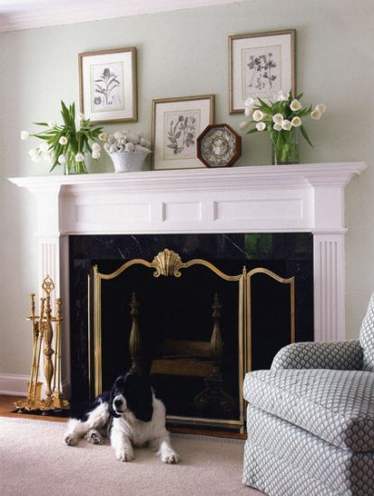
Our next post, Mantel Mania, comes from The Lettered Cottage, blog of Layla and Kevin Palmer. Here's a simple design for a mantel that covers a lot of horizontal space. Botanical prints are spread out and displayed at different heights and the natural motif is picked up in accessories, including crisp, white (if not a tad floppy) tulips. What do you think of this? Do you like it or is something off to you?
Because I personally have a hard time seeing anything but the octagonal frame, I had to remove it with a little Photoshop magic; take a look, below. Ahhhh, much better. I still am not sure about the resting frame. I love the idea of layered frames but feel it is more effective when the size is varied. Do you agree?
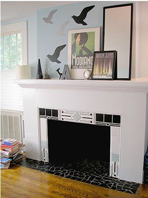
This next asymmetrical arrangement uses a mirror and prints on one side balanced by accessories and vinyl wall decals on the other. Cool, chic, modern, and goes perfectly with the style of the fireplace itself.
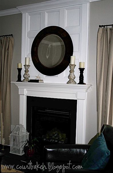
Layla helped client, Courtney Baker, with the design for this beauty. The molding above the mantel wasn't originally there, but creates such a dramatic effect. I would be inclined to go with lighter and more unusual accessories but wanted to showcase the gorgeous look that can be created by extending your "mantle" up to the ceiling.
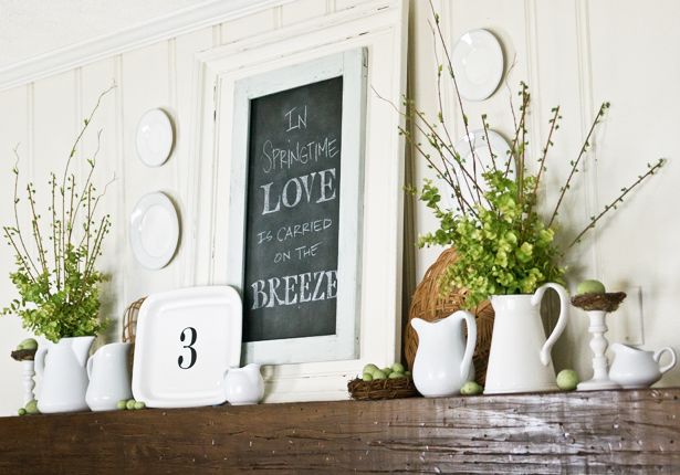
A little bit of a diversion from my "blog bites" intent, I just have to include a few more posts from The Lettered Cottage. This year, Layla and Kevin set out to change up their home's mantel design with the change of seasons; and they blogged about each one along the way. Here's a little something just for fun!
Spring
Summer
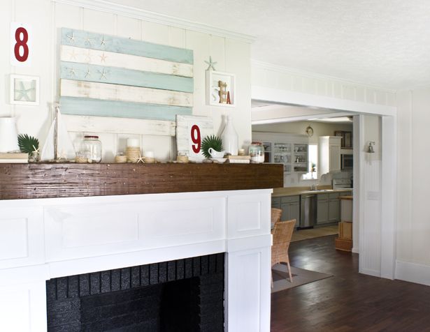
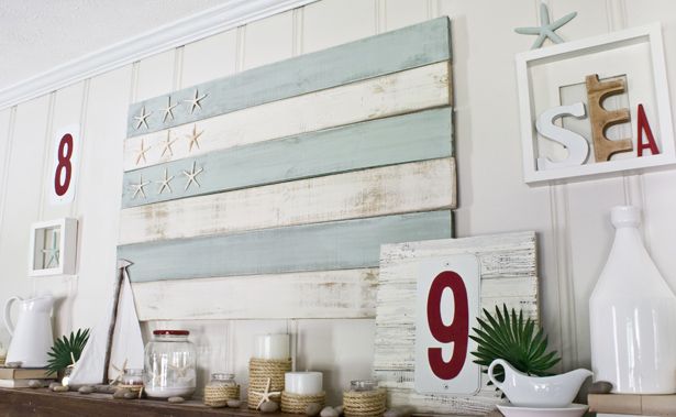
Summer Mantel Images: The Lettered Cottage
Fall
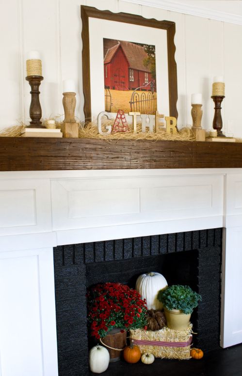
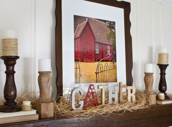
Fall Mantel Images: The Lettered Cottage
And perfectly appropriate for our current season; here are a couple gorgeous winter stunner's.


So tell me, is this a decorating area you have struggled with? I hope this has given you some new ideas. A always, if you have some great ideas on how will you be changing your mantel decor this season or great tips to create great looks, we'd love to hear them!





Great post, Sarah! Re your question as to would the accessories look as good switched to the other side? I think I'd actually like the vignette better with the candlelabra on the right. True, the sofa is on the right, but the visual weight of the dark chest on the left looks heavier to me. Either way, it's beautiful! But I agree with you on everything else!
ReplyDeleteThanks Anne for your design eye and input! I love to hear other viewpoints because it helps all readers to look at things from another lens. Have a great day and thanks again Anne!
ReplyDeleteGreat post indeed and Anne's comment made me go back and rethink that particular mantel. I'm of the less is more camp so I'd probably either do just the painting or have two of the same candelabras on either side...but this is why I'm not a designer :) xo
ReplyDeleteVery nice and such a helpful post to anyone doing a mantel. Since mantels are most always both symmetrical and centered I don't find asymmetrical helpful on top. For me, it inevitably looks wrong.
ReplyDeleteI also find most things over the mantel under scale, which draws the eye down and creates "wall gap" on top.
Obviously, this is all very personal and to someone's eye. But in general, I say go bigger over a mantel rather than smaller. I don't find small groupings effective. To me, it's a focal point and needs to act like one.
Jane
Hi Jane, Thanks so much for stopping by. Your comment about scale is so true and such an excellent point.
ReplyDeleteI was amaze with this post so I stop by and do comment.With the pictures you posted it seems that you did a great job!congrats!
ReplyDeleteInkjet Paper