


Pantone's press release explained that turquoise "evokes thoughts of soothing, tropical waters and a langorous, effective escape from the everyday troubles of the world, while at the same time restoring our sense of well-being." Indeed! But while it may be hard to imagine the serenity of tropical waters year-round, the images that have been showcased among many or our favorite interior design blogs in the last ten months illustrate some fabulous possibilities!
This past year, we've seen turquoise everywhere, from nurseries to office space......


Photo: Style & Grace (via Oxygen.com)

Material Girl's Chicago contributor, Julia Buckingham Edelmann stepped right up to the plate, offering up her "ode to turquoise" early this year when the official announcement was made. Her post, "And the Winner Is..." showcased this delightful corner... bar! What'll you have?

Photo: Metropolitan Home
Now one certainly can't talk turquoise without meeting Erin of House of Turquoise, who shamelessly admits her obsession for the color. If you want to see image after fabulous image of turquoise inspiration, you must check out her blog!
In her post, "Delightful Turquoise Laundry Rooms", we are enamored with images of charming spaces that would motivate anyone to get a little ironing done! They give me a sense of domesticity of days gone by. I imagine this is the type of laundry area Americas' Mom, Mrs. Cleaver - played by the late Barbara Billingsly-must have had!

Original Image: Domino


Chandra Michael's post, "Is it a Coincidence? The Power of Pantone’s Color of the Year", featured two designs that showcase turquoise in subtle and not-so-subtle ways. I can think of quite a few of my clients that would fall in love with these two spaces.
You may not have thought to use turquoise for your kitchen cabinets, but look at what a bold statement you can make. Would you have expected kitchen cabinets to look so amazing in this color? What a way to greet the day! (And yes, in case your wondering, the textile side of my brain has window treatment plans for the windows.)


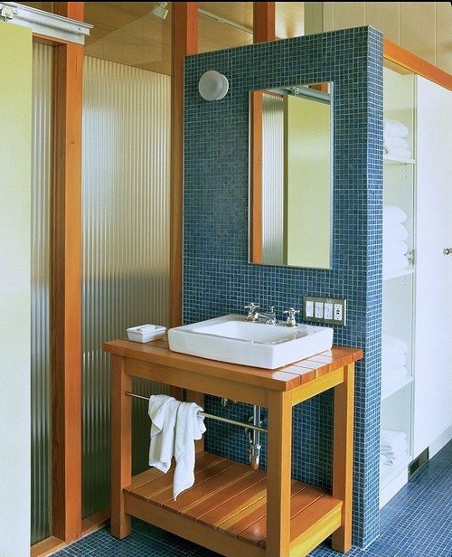
Photo: Architect Koning Eizenberg (via houzz.com)

Photo: Merzbau Design Collective
I'll be honest, these would be perfect for the man of the house but for me, I've got something else in mind! Of all the bathrooms I've seen, this one Seleta shared has my heart! I have never really thought of blue for my own bath but there is an air of romance and girliness to this that makes me wish I had one just like it of my own.
I am imagining a deep claw-foot soaking tub on the opposing wall we do not see. Ahhh, a good book, soak in the tub...sounds perfectly wonderful after a long day, doesn't it?
But before I run off, I must bring up the fact that the end of the year isn't actually too far away. You know what that means? You got it. Pantone will be announcing the 2011 Color of the Year before we know it. Care to make a prediction? 2007 was awarded to Chili Pepper. 2008 was Blue Iris. 2009 was Mimosa. Take a leap... what color do you think we'll be seeing next?
I'd love to hear your thoughts so please leave a comment, it makes my day to hear from you.
I'd love to hear your thoughts so please leave a comment, it makes my day to hear from you.


Love the kitchen cabinets ! I'm going to have to go to with gray for the next color of the year. It's everywhere !
ReplyDeleteI do appreciate grays but I hope its something with more vibrancy. Ever since the dot.com bust I always think of color as a mirror to the economy. Do you remember that Tammy? I worked in fashion/apparel industry then and everything was in shades of gray. That being said, I'm hoping for a nice sunny yellow or a lively orange! :-)
ReplyDeleteI would love the color of 2011 to be navy blue. I've always loved navy with white and am seeing this combination more frequently recently.
ReplyDeleteYou may be on to something..Joe Ruggiero just introduced a navy/white collection for Sunbrella and silver has still been strong (silver + navy = NICE)so you could be right!
ReplyDeleteWell, my favorite is the turquoise laundry room... but a close second favorite would have to be the turquoise scribbly wallpaper in that bathroom!!! How about if we try to think of all of 'today's' names for turquoise? Spa, Tiffany Box Blue etc.
ReplyDeleteI'm in love with that wallpaper too! And as to your color query... Robins Egg blue.. Whythe blue...
ReplyDeleteThere are 2 photos that stopped me in my tracks-The Kensington House and the Phoebe Howard photo. It is their subliminal details that take the symbolic meaning of the color turquoise to the next level of design. In the Kensington House the soft ripple effect of the sea is played off on the headboard, the exquisite ripple fold sheers, and the soft curves of the furniture. In the Howard room, the mirror sets the tone with the scallop edges which is then reflected in the valence across the room. Colors not only inspire a room, but they can inspire our selection in the details we choose.
ReplyDeleteI love the turquoise in the nursery, but I'm not daring enough to try it in other rooms of my house!
ReplyDeleteI like the turquoise living room with the black and white couch, I might be having a bathroom soon that has the black and white tiles on the floor, and was wondering what wow color I could paint the walls, kinda like the turquoise .
ReplyDeleteHey Sarah, do you think if I paint my laundry room turquoise it will help soothe me into keeping it as clean as the one in the photo? ;)
ReplyDeleteGrace, when a color feels tempting but a little too bold for use in a big way its fun to put it somewhere surprising, such as the inside of a closet or back wall of a hutch or china cabinet. Sue, glad to inspire!
ReplyDeleteLisa, I can't guarantee it but I say, hey, why not give it a good ol' college try!! :-)
I might actually spend time in my laundry room if it looked like that. Turquoise is a happy color! Beaches, sand ,pina coladas..............
ReplyDeleteIt seems to be a unanimous thought that one would spend more time in the laundry room if it was painted turquoise so ok, who's going first?
ReplyDeleteWhile I must say that I am not a huge fan of turquoise, I have seen some stunning combonations come across my workroom table lately. Turquoise being paired with everything from brights to browns. Gorgeous!
ReplyDeleteMy oldest daughter has been begging for a turquoise and brown bedroom...that just might happen!
As for 2011 color, I would love to see the yellows, too. Walked through a model home once that was completely done in yellow, taupe and black. Fabulous!
That is the luxury of being in this business; we get to work with so many combinations. There are so many things to love even though knowing it may not be in your color zone. Holidays are right around the corner, bet your daughter would be psyched to get her room done as a surprise Mom! :-)
ReplyDeleteI have 50 yard of green silk waiting to be made into drapes for MY bedroom. I think that if I did my daughter's room for a second time without getting mine done first, I'd be sleeping in there with her!! (Did I mention that I've had the green silk for a year???!!!)
ReplyDelete